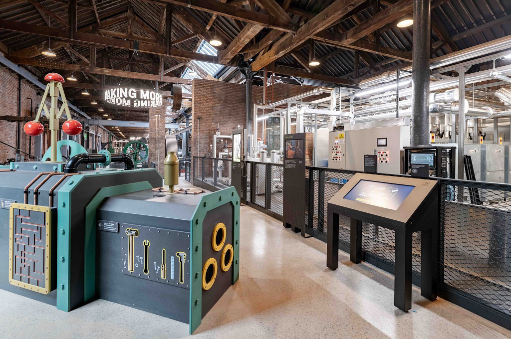
Design of signage and interpretation graphics for the refurbished gallery Power Hall.
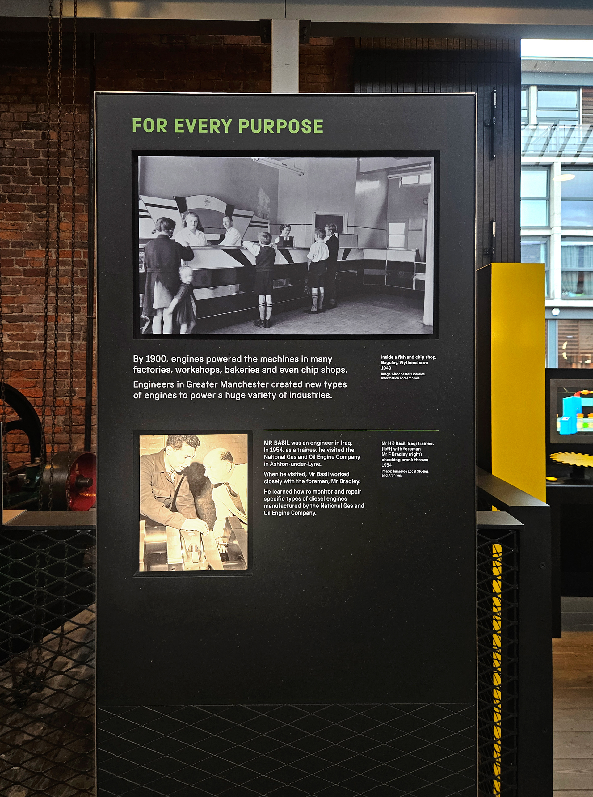
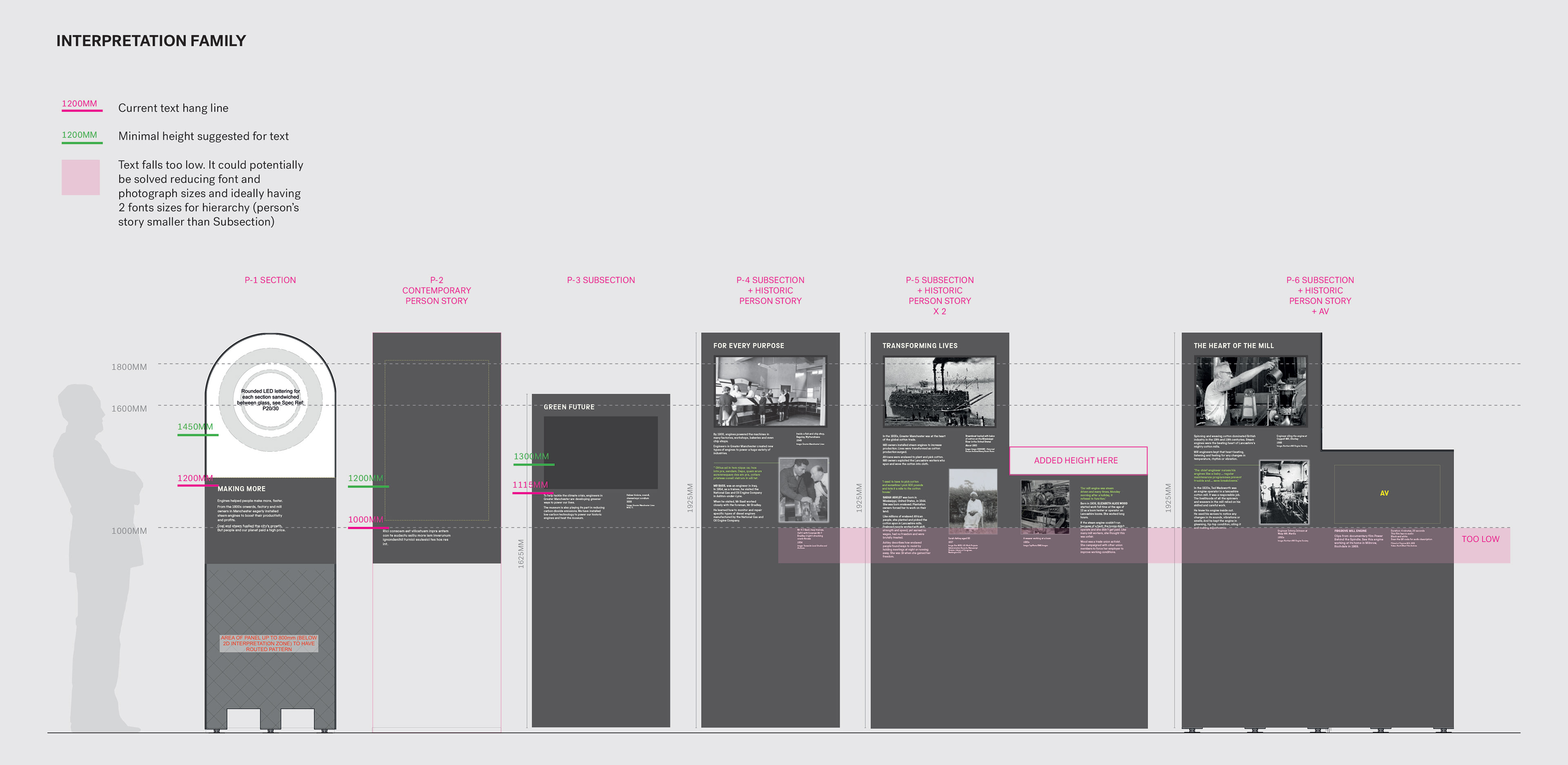
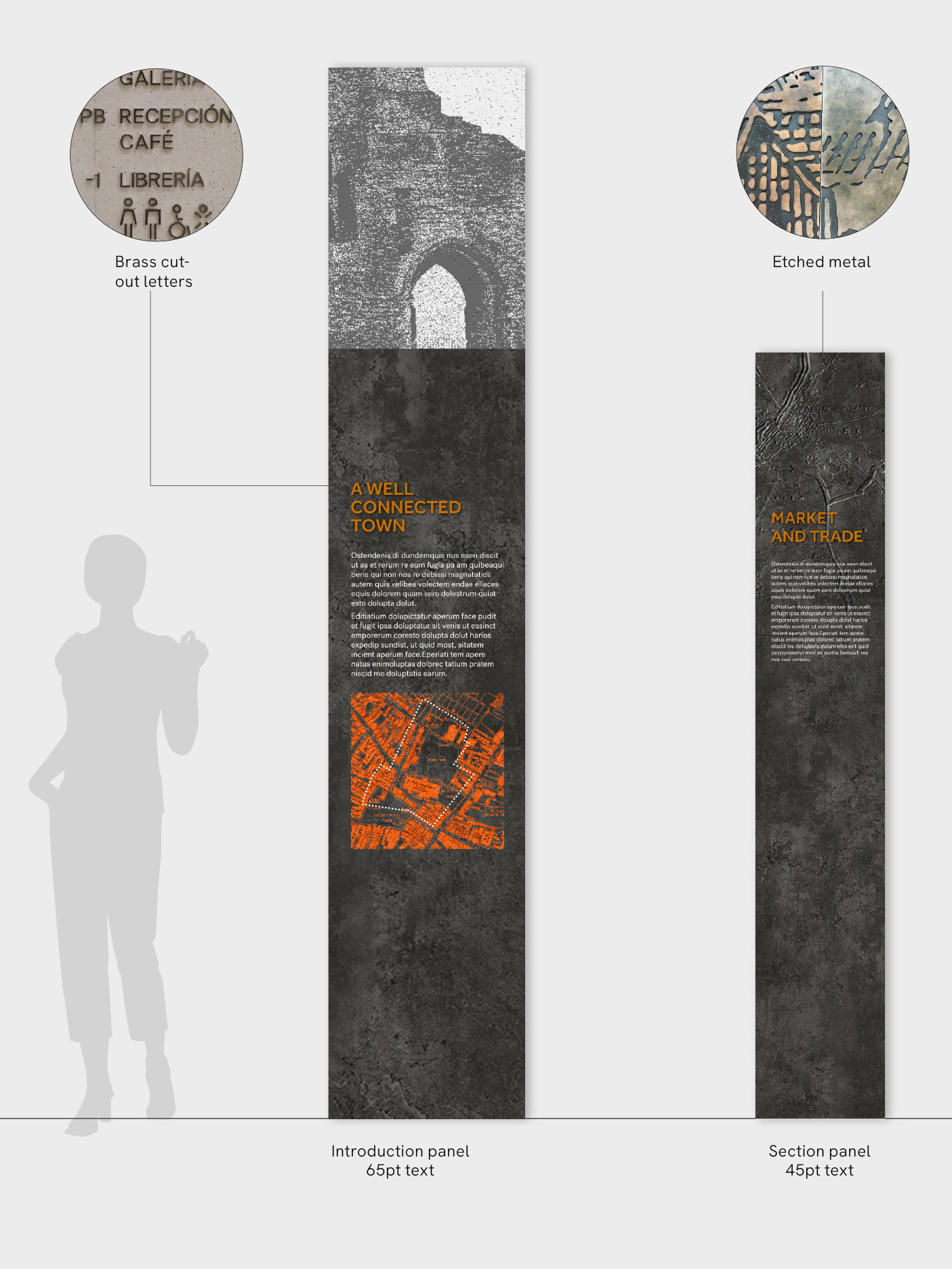
The architects had established a limited range of panel options, while the client needed to display more than 20 types of interpretation levels. I analyzed the content and developed a system of layouts, heights, font sizes and weights that maintained visual consistency while allowing for those hierarchy variations.
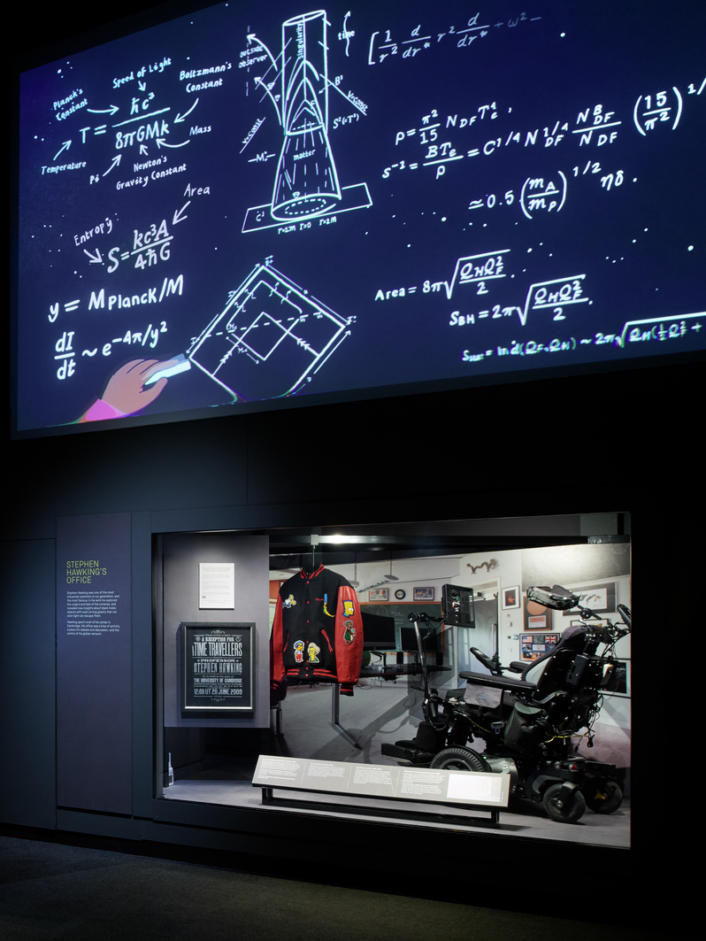
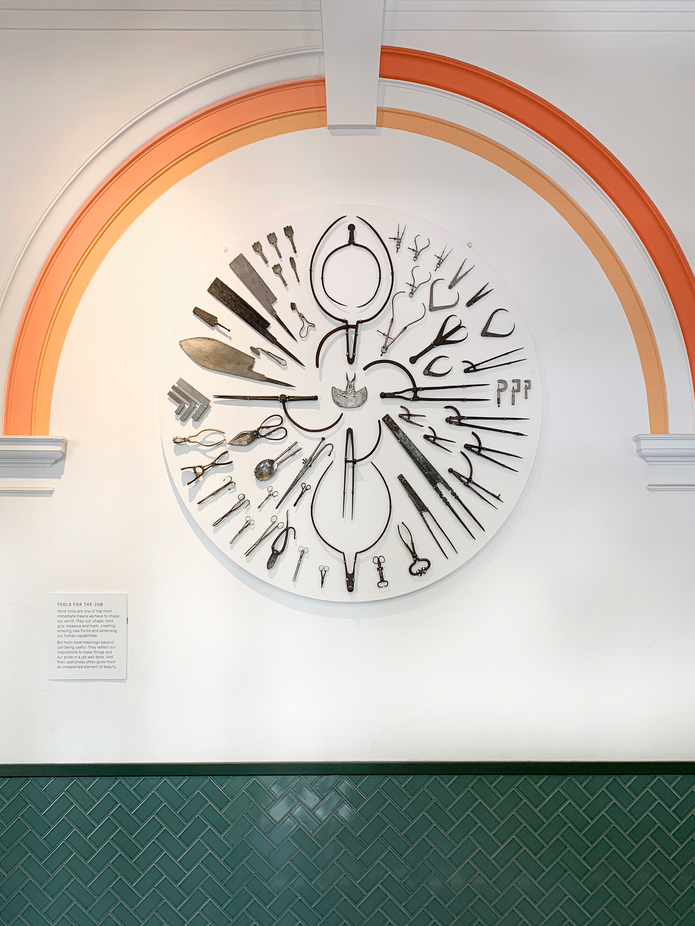
I created specific elevations and diagrams to help the team agree on interpretation sizes that achieved maximum visibility of the objects (without graphics obscuring the view) while keeping text at an appropriate height for maximum accessibility.
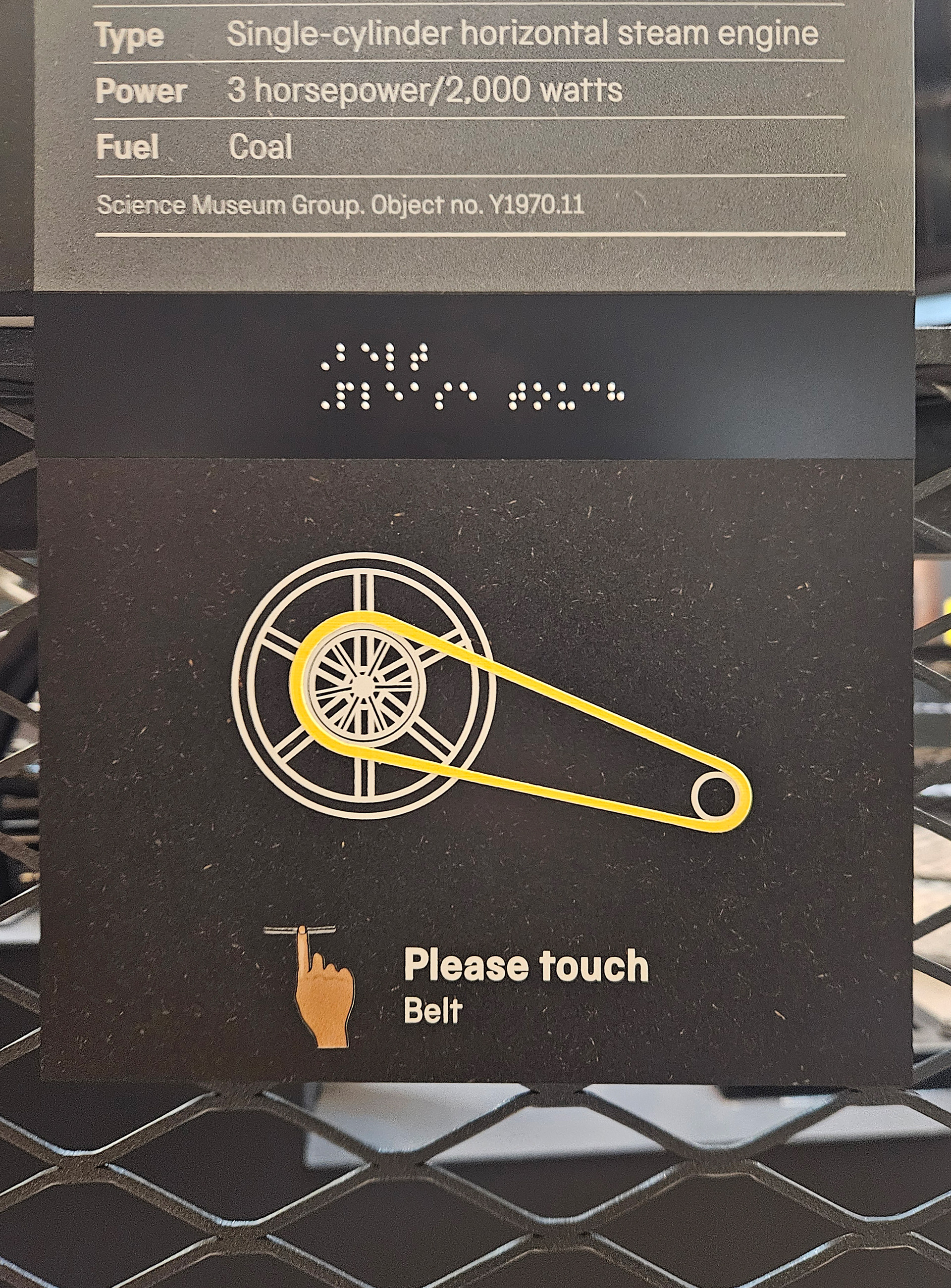
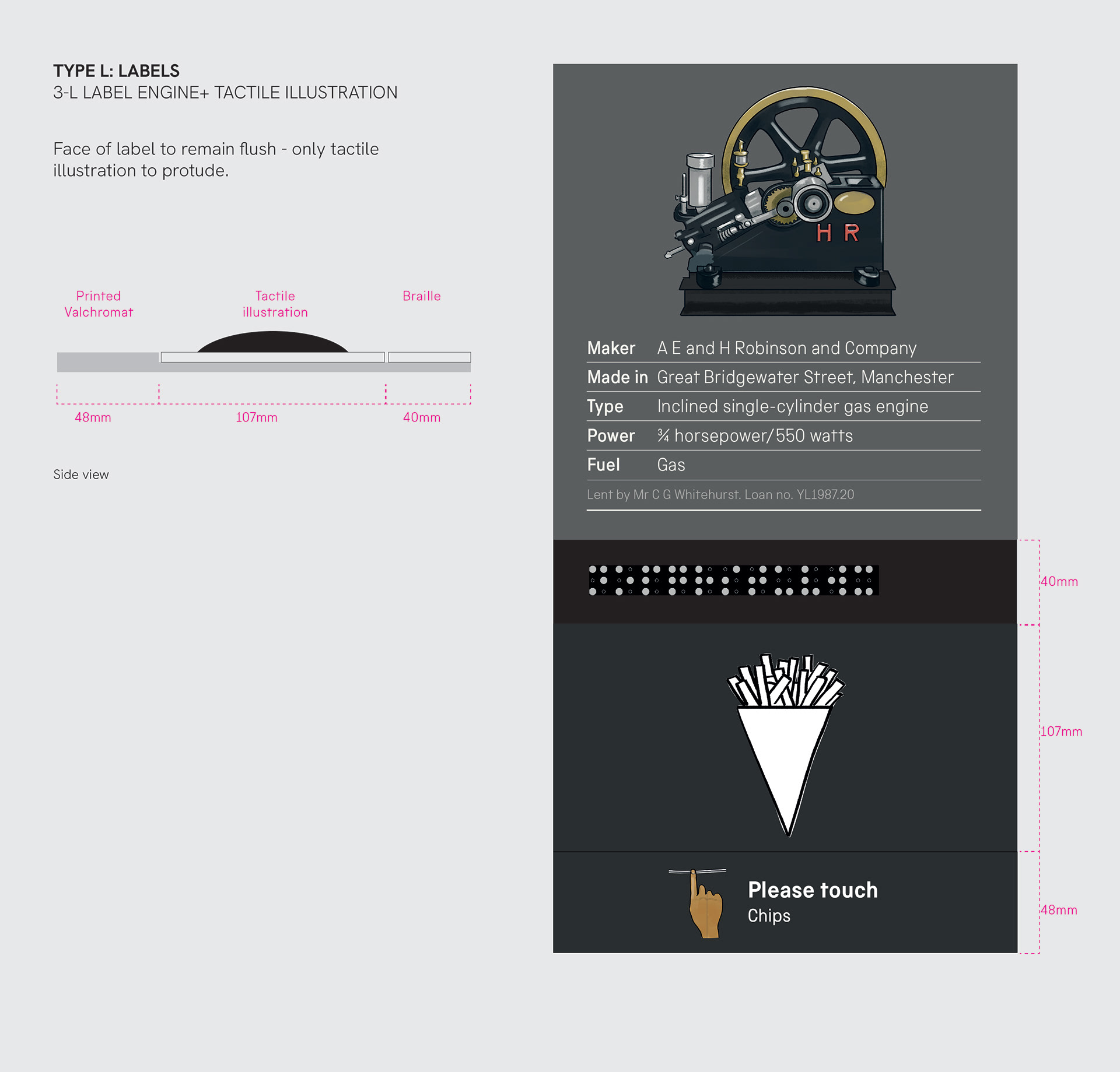
I collaborated with fabricators and printers to create tactile labels layering several hits of ink slotted next to the Braille caption.